
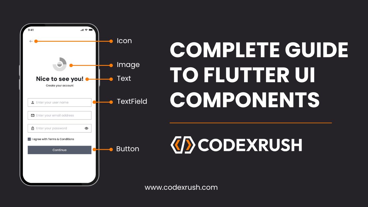
Complete Guide to Flutter UI Components (2025 Best Practices)
Flutter, Google’s open-source UI framework, provides a rich set of UI components that help developers build beautiful, responsive, and high-performance mobile applications. With Flutter, you can create stunning user interfaces that run seamlessly on both iOS and Android with the same codebase.
In this blog, we’ll walk you through all the essential Flutter UI components, explaining each one with common properties and example code to help you understand their usage. By the end of this guide, you will have a solid grasp of Flutter’s UI components and how to integrate them effectively into your applications.
1. Container
Container is one of the most commonly used widgets in Flutter. It allows you to create rectangular visual elements, with the ability to apply padding, margin, decoration, and other styling options.
Common Properties:
- padding: Adds space inside the container.
- margin: Adds space outside the container.
- decoration: Allows you to add borders, backgrounds, and shadows.
- height/width: Defines the dimensions of the container.
Example Code:
					Container(
  padding: EdgeInsets.all(20),
  margin: EdgeInsets.all(10),
  decoration: BoxDecoration(
    color: Colors.blue,
    borderRadius: BorderRadius.circular(10),
  ),
  child: Text(
    'Hello, Flutter!',
    style: TextStyle(color: Colors.white, fontSize: 18),
  ),
)
2. Text
Text is used to display a string of text. It is one of the most fundamental widgets in Flutter.
Common Properties:
- style: Allows you to define the font, size, weight, color, etc.
- textAlign: Aligns the text within its container (e.g., TextAlign.center).
- maxLines: Limits the number of lines the text can span.
Example Code:
					Text(
  'Flutter is awesome!',
  style: TextStyle(
    color: Colors.black,
    fontSize: 20,
    fontWeight: FontWeight.bold,
  ),
  textAlign: TextAlign.center,
)
3. Column
Column is a layout widget that arranges its children vertically.
Common Properties:
- mainAxisAlignment: Aligns children vertically (e.g., MainAxisAlignment.center).
- crossAxisAlignment: Aligns children horizontally (e.g., CrossAxisAlignment.start).
- children: A list of widgets inside the column.
Example Code:
					Column(
  mainAxisAlignment: MainAxisAlignment.center,
  crossAxisAlignment: CrossAxisAlignment.center,
  children: <Widget>[
    Text('First Item'),
    Text('Second Item'),
  ],
)
4. Row
Row is a layout widget that arranges its children horizontally.
Common Properties:
- mainAxisAlignment: Aligns children horizontally (e.g., MainAxisAlignment.spaceBetween).
- crossAxisAlignment: Aligns children vertically (e.g., CrossAxisAlignment.center).
- children: A list of widgets inside the row.
Example Code:
					Row(
  mainAxisAlignment: MainAxisAlignment.spaceBetween,
  crossAxisAlignment: CrossAxisAlignment.center,
  children: <Widget>[
    Icon(Icons.home),
    Icon(Icons.search),
    Icon(Icons.notifications),
  ],
)
5. ElevatedButton
ElevatedButton is a material design button that reacts to touch by filling with color.
Common Properties:
- onPressed: The function called when the button is pressed.
- style: Customizes the button’s appearance (e.g., color, shape).
- child: The widget inside the button (usually a Text widget).
Example Code:
					ElevatedButton(
  onPressed: () {
    print('Button Pressed');
  },
  style: ElevatedButton.styleFrom(primary: Colors.blue),
  child: Text('Click Me'),
)
6. TextField
TextField is a widget that allows users to input text. It’s commonly used for forms or user input fields.
Common Properties:
- controller: A TextEditingController to manage the text in the field.
- decoration: To style the text field, like adding hints or borders.
- obscureText: Used for password fields, hides the text entered.
Example Code:
					TextField(
  controller: _controller,
  decoration: InputDecoration(
    labelText: 'Enter your name',
    border: OutlineInputBorder(),
  ),
)
7. ListView
ListView is a scrollable list of widgets. It’s one of the most powerful and flexible widgets in Flutter.
Common Properties:
- children: A list of widgets to display.
- itemBuilder: A function to build items dynamically.
- scrollDirection: The direction the list scrolls in (horizontal or vertical).
Example Code:
					ListView(
  children: <Widget>[
    ListTile(title: Text('Item 1')),
    ListTile(title: Text('Item 2')),
    ListTile(title: Text('Item 3')),
  ],
)
8. Image
The Image widget is used to display images in your Flutter app, either from assets, files, or the network.
Common Properties:
- image: The source of the image (e.g., NetworkImage or AssetImage).
- fit: Controls how the image should be fitted within its box (e.g., BoxFit.cover).
- width/height: Dimensions for the image.
Example Code (Network Image):
					Image.network(
  'https://flutter.dev/assets/flutter-logo-sharing-66d3f29d15762e10b659e302b242717be6c2f9797f7288b7036e163b5fba5ad6.png',
  width: 100,
  height: 100,
  fit: BoxFit.cover,
)
Example Code (Local Asset Image):
					Image.asset(
  'assets/images/logo.png',
  width: 100,
  height: 100,
  fit: BoxFit.cover,
)
9. Scaffold
Scaffold is the top-level container that holds the visual structure of your application, such as app bars, drawers, and floating action buttons.
Common Properties:
- appBar: The top app bar widget.
- body: The main content of the screen.
- floatingActionButton: A button that floats above the content.
Example Code:
					Scaffold(
  appBar: AppBar(title: Text('My Flutter App')),
  body: Center(child: Text('Hello, Flutter!')),
  floatingActionButton: FloatingActionButton(
    onPressed: () {},
    child: Icon(Icons.add),
  ),
)
10. GestureDetector
GestureDetector is a widget that detects user gestures, such as tapping, dragging, or swiping.
Common Properties:
- onTap: Function to call when the widget is tapped.
- onLongPress: Function to call when the widget is long-pressed.
Example Code:
					GestureDetector(
  onTap: () {
    print('Tapped!');
  },
  child: Container(
    color: Colors.blue,
    padding: EdgeInsets.all(20),
    child: Text('Tap Me', style: TextStyle(color: Colors.white)),
  ),
)
11. FloatingActionButton
FloatingActionButton (FAB) is a circular button that typically floats above the content of the screen. It’s used for primary actions like adding, editing, or initiating a process.
Common Properties:
- onPressed: A callback function for the button press.
- child: Typically an icon or text inside the button.
- backgroundColor: The background color of the button.
- mini: A flag to create a smaller FAB.
Example Code:
					FloatingActionButton(
  onPressed: () {
    print('FAB pressed');
  },
  child: Icon(Icons.add),
  backgroundColor: Colors.blue,
)
12. Card
Card is a Material Design widget that displays content in a rounded rectangle. It’s commonly used for displaying items in a list with a subtle shadow.
Common Properties:
- color: Sets the background color of the card.
- elevation: Controls the shadow depth of the card.
- child: The widget inside the card.
Example Code:
					Card(
  elevation: 5,
  shape: RoundedRectangleBorder(borderRadius: BorderRadius.circular(10)),
  child: ListTile(
    title: Text('Card Title'),
    subtitle: Text('Card Subtitle'),
  ),
)
13. Drawer
Drawer is a slide-in menu that typically appears from the left side of the screen, providing a way to navigate between different sections of the app.
Common Properties:
- child: The content of the drawer, which can include a list of items.
- elevation: The depth of the drawer when it slides in.
Example Code:
					Scaffold(
  appBar: AppBar(title: Text('Drawer Example')),
  drawer: Drawer(
    child: ListView(
      children: <Widget>[
        DrawerHeader(child: Text('Header')),
        ListTile(title: Text('Item 1')),
        ListTile(title: Text('Item 2')),
      ],
    ),
  ),
  body: Center(child: Text('Main Content')),
)
14. TabBar & TabBarView
TabBar and TabBarView are used to create tabbed navigation. TabBar is the header, while TabBarView displays the content for each tab.
Common Properties:
- controller: Used to link the TabBar with the TabBarView.
- tabs: List of Tab widgets representing each tab.
- children: The content corresponding to each tab.
Example Code:
					DefaultTabController(
  length: 3,
  child: Scaffold(
    appBar: AppBar(
      title: Text('Tabs Example'),
      bottom: TabBar(
        tabs: [
          Tab(text: 'Tab 1'),
          Tab(text: 'Tab 2'),
          Tab(text: 'Tab 3'),
        ],
      ),
    ),
    body: TabBarView(
      children: [
        Center(child: Text('Content for Tab 1')),
        Center(child: Text('Content for Tab 2')),
        Center(child: Text('Content for Tab 3')),
      ],
    ),
  ),
)
15. Snackbar
Snackbar provides brief feedback about an operation in a small popup at the bottom of the screen. It’s used for messages that do not require user interaction.
Common Properties:
- content: The message to display.
- duration: How long the snackbar should stay visible.
- action: Optional action button (e.g., undo).
Example Code:
					ScaffoldMessenger.of(context).showSnackBar(
  SnackBar(
    content: Text('This is a Snackbar message!'),
    duration: Duration(seconds: 2),
  ),
)
16. Switch
Switch is a widget that allows users to toggle between two options (on/off or true/false).
Common Properties:
- value: The current state of the switch (true or false).
- onChanged: A callback function to change the value when the switch is toggled.
Example Code:
					Switch(
  value: _isSwitched,
  onChanged: (bool value) {
    setState(() {
      _isSwitched = value;
    });
  },
)
17. CircularProgressIndicator & LinearProgressIndicator
These are used to show loading indicators in your app. CircularProgressIndicator shows a spinning circle, while LinearProgressIndicator shows a horizontal bar.
Common Properties:
- value: A double value indicating progress (for LinearProgressIndicator).
- strokeWidth: The thickness of the circular progress indicator.
Example Code (Circular):
					CircularProgressIndicator(
  value: 0.5, // Represents 50% progress
  strokeWidth: 6,
)
Example Code (Linear):
					LinearProgressIndicator(
  value: 0.5, // Represents 50% progress
)
18. RaisedButton (Deprecated) / ElevatedButton
RaisedButton has been replaced with ElevatedButton. It is used for material design buttons that are elevated from the surface with shadows.
Common Properties:
- onPressed: The callback function for the button press.
- child: Usually a Text or an Icon.
- style: Used to customize the button’s appearance.
Example Code:
					ElevatedButton(
  onPressed: () {
    print('ElevatedButton Pressed');
  },
  style: ElevatedButton.styleFrom(primary: Colors.blue),
  child: Text('Press Me'),
)
19. Radio
Radio is used to select a single option from a group of options.
Common Properties:
- value: The value of the selected option.
- groupValue: The current value of the group.
- onChanged: A callback function to change the selection.
Example Code:
					Radio<int>(
  value: 1,
  groupValue: _selectedValue,
  onChanged: (int? value) {
    setState(() {
      _selectedValue = value!;
    });
  },
)
20. Slider
Slider allows users to select a value from a range by dragging a slider thumb.
Common Properties:
- value: The current value of the slider.
- min/max: The minimum and maximum values the slider can take.
- onChanged: A callback function to change the value.
Example Code:
					Slider(
  value: _currentValue,
  min: 0,
  max: 100,
  onChanged: (double value) {
    setState(() {
      _currentValue = value;
    });
  },
)
21. Expanded
Expanded is used to make a child widget of a Row, Column, or Flex take up the available space in the main axis.
Common Properties:
flex: Controls the proportion of space taken (default is 1).
Example Code:
					Row(
  children: <Widget>[
    Container(color: Colors.red, width: 50, height: 50),
    Expanded(
      child: Container(color: Colors.blue, height: 50),
    ),
  ],
)
22. Stack
Stack allows you to overlay multiple widgets on top of each other. It’s great for creating complex layouts like image overlays, badges, and more.
Common Properties:
- alignment: Aligns the children widgets within the stack.
- children: A list of widgets to display within the stack.
Example Code:
					Stack(
  alignment: Alignment.center,
  children: <Widget>[
    Container(color: Colors.blue, width: 200, height: 200),
    Positioned(
      bottom: 10,
      child: Text('Overlay Text'),
    ),
  ],
)
23. AlertDialog
Used to show alerts, confirmations, or dialogs with messages and actions.
Common Properties:
title: Title of the dialog.
content: Message or widget content.
actions: List of buttons at the bottom.
Example Code:
					showDialog(
  context: context,
  builder: (BuildContext context) {
    return AlertDialog(
      title: Text("Delete Item"),
      content: Text("Are you sure you want to delete this item?"),
      actions: [
        TextButton(onPressed: () => Navigator.pop(context), child: Text("Cancel")),
        TextButton(onPressed: () {}, child: Text("Delete")),
      ],
    );
  },
);
24. ListView.builder
Efficiently creates scrollable lists of data using lazy loading.
Common Properties:
itemCount: Total number of items.
itemBuilder: Builds each item.
scrollDirection: Horizontal or vertical.
Example Code:
					ListView.builder(
  itemCount: 10,
  itemBuilder: (context, index) {
    return ListTile(
      title: Text('Item $index'),
    );
  },
)
25. GestureDetector
Adds interactivity by detecting gestures like tap, double-tap, swipe, etc.
Common Properties:
onTap
onDoubleTap
onLongPress.
Example Code:
					GestureDetector(
  onTap: () {
    print('Tapped!');
  },
  child: Container(
    color: Colors.green,
    padding: EdgeInsets.all(16),
    child: Text('Tap Me'),
  ),
)
26. AnimatedContainer
Allows smooth animations when changing size, color, etc.
Common Properties:
duration: Duration of animation.
curve: Animation curve.
Other styling properties like width, height, color.
Example Code:
					AnimatedContainer(
  duration: Duration(seconds: 1),
  width: isExpanded ? 200 : 100,
  height: 100,
  color: isExpanded ? Colors.red : Colors.blue,
  child: Text("Animated Box"),
)
27. MediaQuery
Used to get information about the screen size, pixel density, and orientation.
Common Properties:
duration: Duration of animation.
curve: Animation curve.
Other styling properties like width, height, color.
Example Code:
					double width = MediaQuery.of(context).size.width;


Container(
  width: MediaQuery.of(context).size.width * 0.5,
  height: 100,
  color: Colors.amber,
)
28. Visibility
Show or hide widgets conditionally without removing them from the widget tree.
Common Properties:
visible: Boolean to toggle visibility.
child: The widget to show/hide.
Example Code:
					Visibility(
  visible: _isVisible,
  child: Text('Now you see me!'),
)
29. ClipRRect
Clips its child with rounded corners.
Common Properties:
borderRadius: Radius of the rounded corners.
child: Widget to clip.
Example Code:
					ClipRRect(
  borderRadius: BorderRadius.circular(10),
  child: Image.network('https://picsum.photos/200'),
)
30. Wrap
Wraps widgets onto multiple lines or columns if there isn’t enough space.
Common Properties:
spacing, runSpacing: Space between items.
children: List of widgets.
Example Code:
					Wrap(
  spacing: 8,
  runSpacing: 4,
  children: List.generate(
    6,
    (index) => Chip(label: Text('Chip $index')),
  ),
)


")